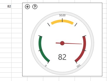
One of the first things I’m often asked for when building a dashboard is “one of those speedo things – you know, a dial with a moving needle”. They’re not always the most useful chart to have on your dashboard as they only show you a single absolute value – but… well they’re just fun aren’t they?
When I create a dashboard, I tend to build the charts from scratch, not use third party add-ins, but there are some free “apps” for Excel that can be a lot of fun to use and will get you going with a basic dashboard in about 30 seconds.
So, if you have a desire for a superfast speedometer in one of your spreadsheets, navigate to the Insert ribbon in Excel and choose My Add-Ins

An overlay pop-up will show up with anything you’ve already installed visible. Assuming you haven’t already got it installed then you’ll need to choose Store and then search for the app called Gauge. Choose the Free version.

You’ll need to Trust It then the app will appear in a small box on your spreadsheet workbook

Now you just need to tell it which cell in your worksheet contains the number to go on the dial.
Click Insert Gauges and select this cell – and there you have it – instant speedo!

If you choose a range of cells, instead of just one, then you’ll see a row of little speedos, each attached to a single cell in the range you’ve chosen. Cool huh?
In the top left of the app box is a gear icon. Click this to see the settings. You’ll see you can change where the different colours start and stop. For example you may well want to have red at the start of the dial and green on the right. This is easy to change by altering the start and stop numbers in the settings.
Some other apps that you may want to play with for your dashboard are Bubbles, Radial Chart and People Graph. Bubbles is especially cute as they bounce around as you select them.
Leave a Reply Cancel reply
@JOANNE.SPARKES
on Instagram
Follow Along